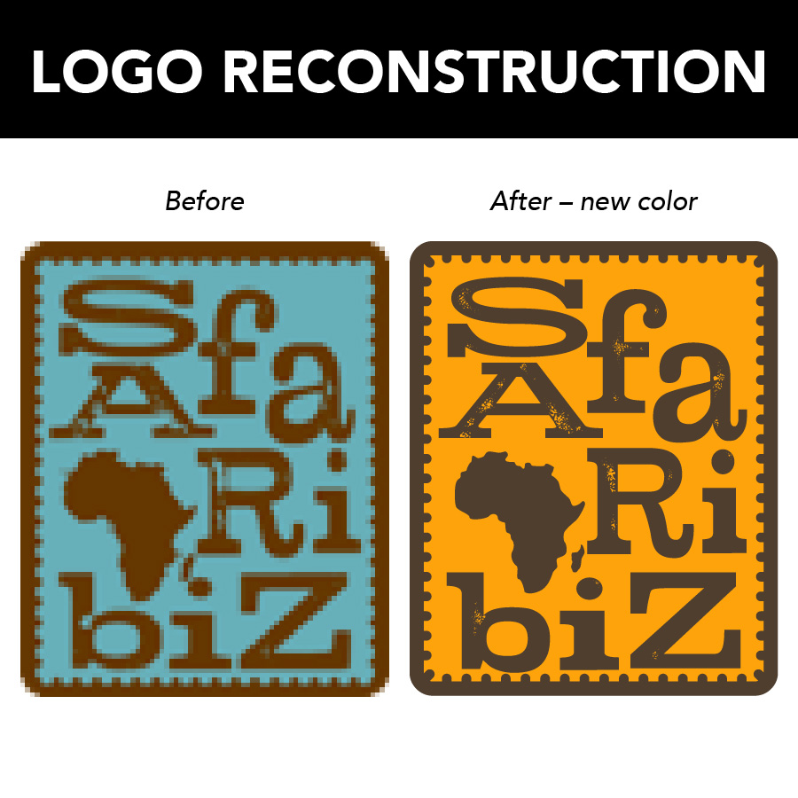
A logo recreation is what happens when you no longer have your original logo files and need to have the vector file reconstructed from scratch. You may have a small JPG or PNG file, but it’s grainy when scaled up on your business card or website. Or maybe you’re getting ready to print some swag and the printer asks for your logo in a vector file format – and you don’t have one (and if you don’t know what vector files are, read this).
For your graphic designer, a logo recreation is a little like an episode of CSI, except I’m solving the mystery of fonts, shapes and colors. Here’s a case study of a very unique logo that I recreated for SafariBiz, and some of the cool workarounds I used to make it happen.
The Situation
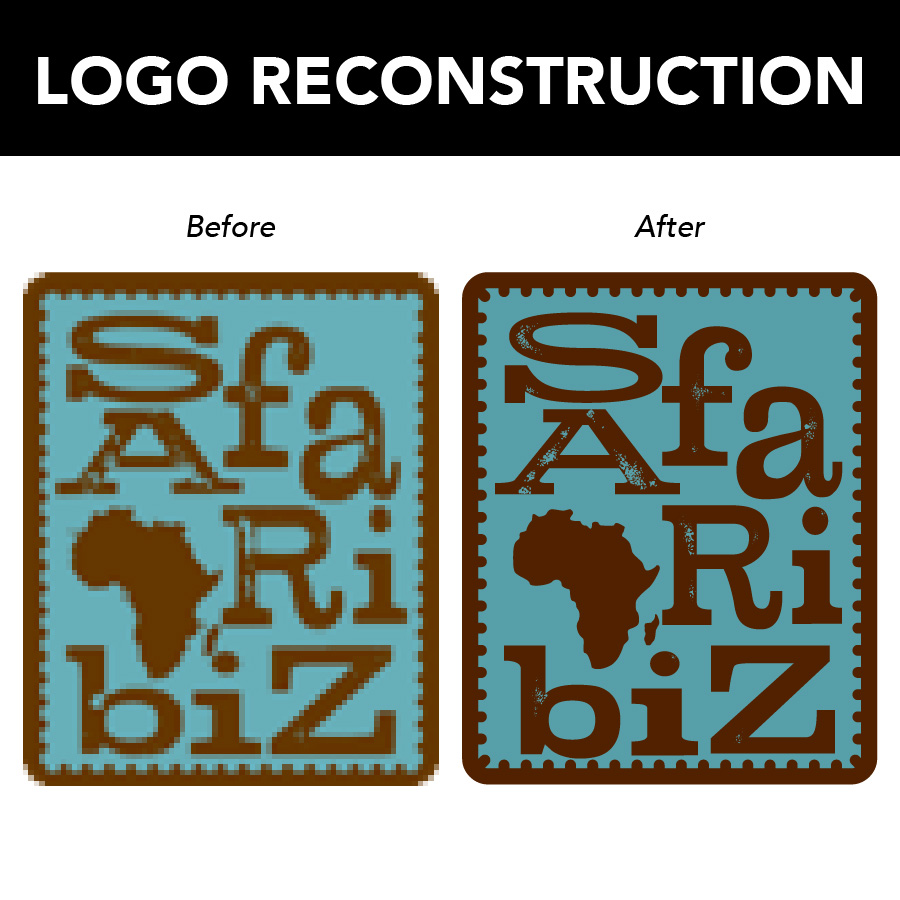
SafariBiz is a boutique travel agency that specializes in custom trips to Africa. They had a small JPG of their logo, but had lost touch with the original designer and could not get ahold of the original source files or any information about the original logo. To complicate things a bit more, the letters were also individually stretched either horizontally or vertically, making it impossible for a font finder to make a visual match. Some good old fashioned detective work is in order!
The solution
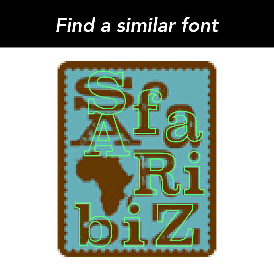
1. Find a similar font – The letters of the original logo were modified too much for an automatic font finder to make a match, so I manually went through my font list to find ones that were a close match to the original letters.
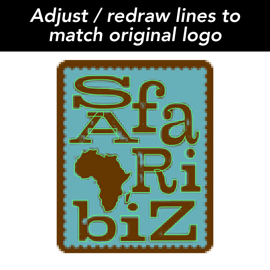
2. Outline the font and manually match the points – The match wasn’t perfect, so I outlined the font (turn the live, editable text into a series of movable vector points) and manually adjusted the points and curves to better fit the original letters. I ended up completely redrawing parts of the ‘A’ and ‘R’ to make the lines match.
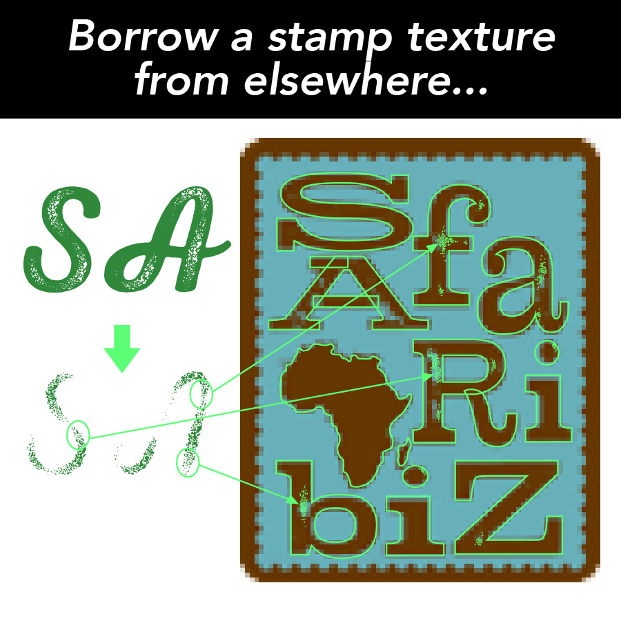
3. Apply stamp texture from another font – The original logo had a stamp texture on the letters. Of course, the font I found didn’t come with a stamp texture, so I had to get that from somewhere else. I found another font in my collection that does have a nice stamp texture, outlined that so I could copy out bits of the texture, and manually applied the texturing to the letters in the SafariBiz logo. After that, I simply used the Pathfinder tool to cut out the areas I’d applied the texture, and voila, custom stamp-textured letters!

4. After that, I simply used the Pathfinder tool to cut out the areas I’d applied the texture, and voila, custom stamp-textured letters!
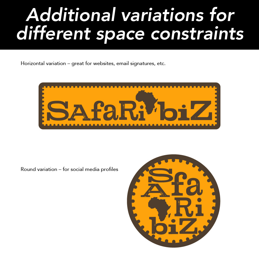
5. Create variations for different use cases – Now that I had a base vector logo, we could explore some different color combinations to freshen up the look and feel of the logo. I also rearrange the elements to create the horizontal and round / square social media variations of the original logo so that SafariBiz has more options for displaying the logo with different space constraints.
6. Export high resolution files for each variation, and of course, the vector files. Now that SafarBiz has all these files, their logo can be perfectly clear at whatever size they need. They also got a reference document with the fonts and colors used in the logo, so they can create additional marketing pieces with some of the same look and feel.
In this situation, SafariBiz needed several things: their logo recreated, and an update to their color scheme, and other variations of their logo for use in different situations with space constraints. Fortunately, Adobe Illustrator is a very versatile program and I really enjoy a good design mystery. This was a great adventure for me, and I hope SafariBiz will be able to use their new logo files for years to come.
Do you have questions or a logo you want me to look at? Contact me here to get started.
